A multi-product sales channel
This is how we helped insurance distributors to easily sell their products online.
My Role
I was part of a small team of three people alongside a Graphic Design intern and a Front-end developer. This project took place between August and September 2019. I led the "Design System team" -as we called it- and I was responsible for the research, interaction design, visual design and copywriting for the interfaces.
The Challenge
Simple Channels 1.0 was a project by Hello ZUM which provided insurance distributors an alternative to commercialize online some of their basic insurance plans. For the third quarter of 2019, the company decided to work on a more robust version: Simple Channels 2.0.
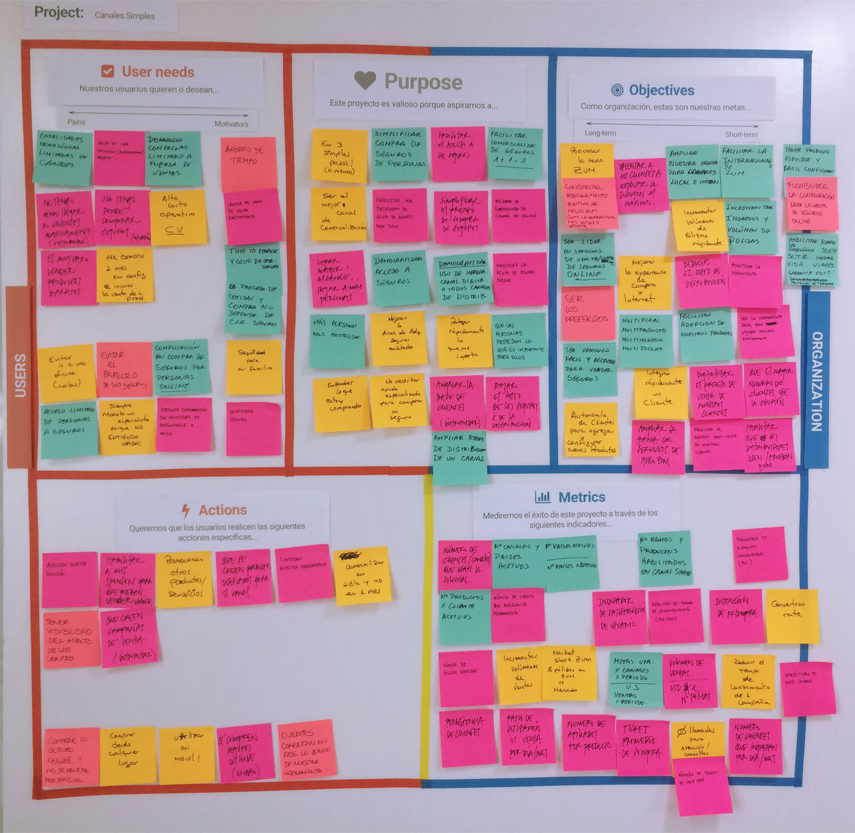
The company wanted Simple Channels 2.0 to be the simplest alternative available to democratize access to insurance and to facilitate its distribution. It basically was a customizable website template to commercialize any kind of insurance you need to put online. Its structure had to be flexible enough to support and rearrange multiple sections, calculations and business rules. It had to be “multi-everything” -as we used to joke about- multi-plan, multi-product, multi-currency, multi-language… To make sure everyone was aligned in terms of what we were going to get from this project, we made a Scope Canvas workshop.
Simpler, better, faster, stronger. Sounds great, but… is it achievable?
The company only had car insurance at the moment, so everyone was very enthusiastic to move to something else, like health or travel insurance, and wanted to develop a landing page and the complete buying process for seven products in six weeks. Remember how I said we were a design team of only three people? Well, taking that into account, we had to progressively talk some sense to them and narrowed that seven down, first to three, and finally, to a not so exciting but very reasonable one.
The Process
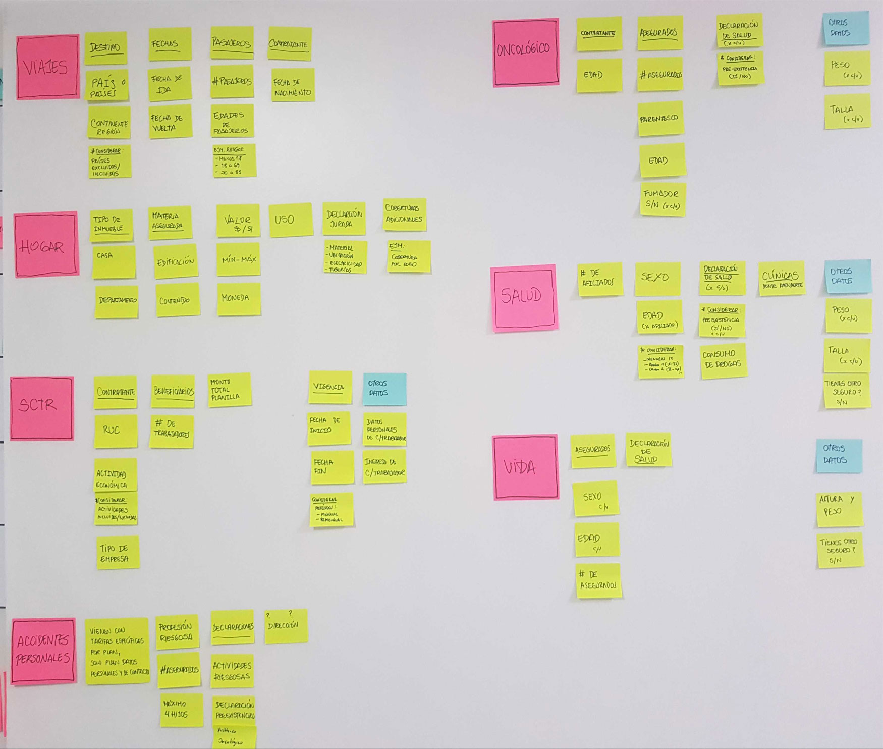
To prove our point, we first needed to size the original seven products. We did some research on how local companies set the parameters to calculate premiums. We also checked their websites, the steps in their buying processes and the specific forms they used for each case. Once we had a big picture, we saw we had better chances with three products: life, health and travel insurance.
The beginning: 3 people for 3 products
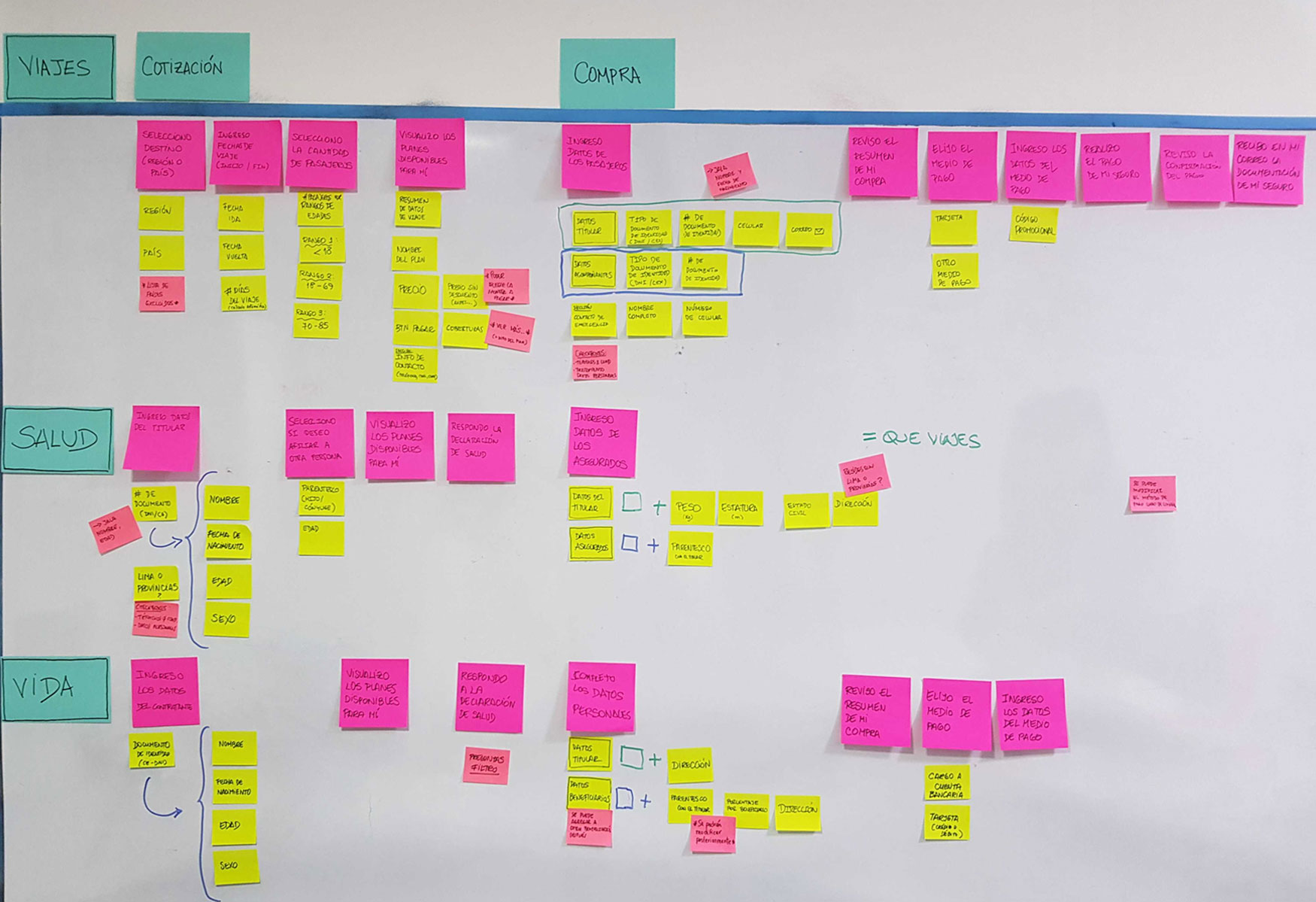
We called different insurance companies pretending to be customers so that we could experience the actual buying process ourselves. It gave as new perspectives and ideas on how to improve it with our customizable site. Life and health insurance were huge but very similar; travel insurance had its own peculiarities but it was small and pretty straight forward.
The approach: Ask me a lot, with only a few
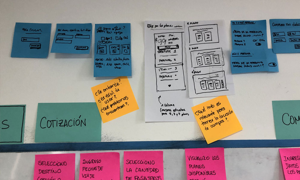
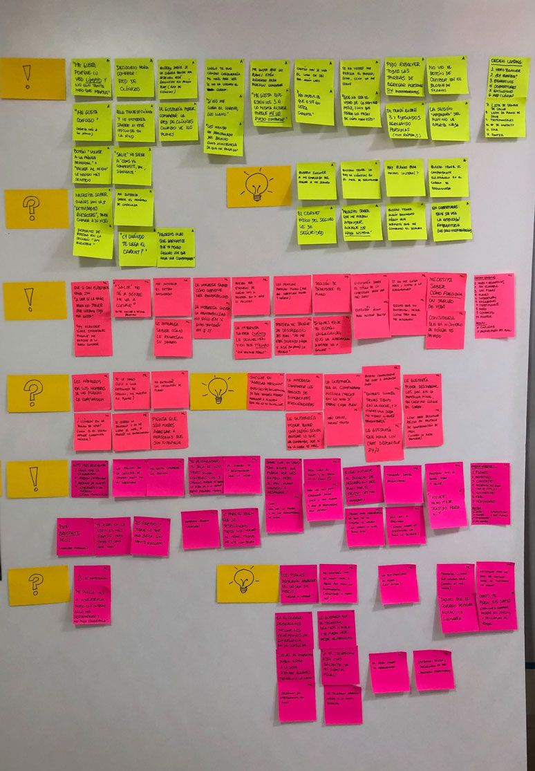
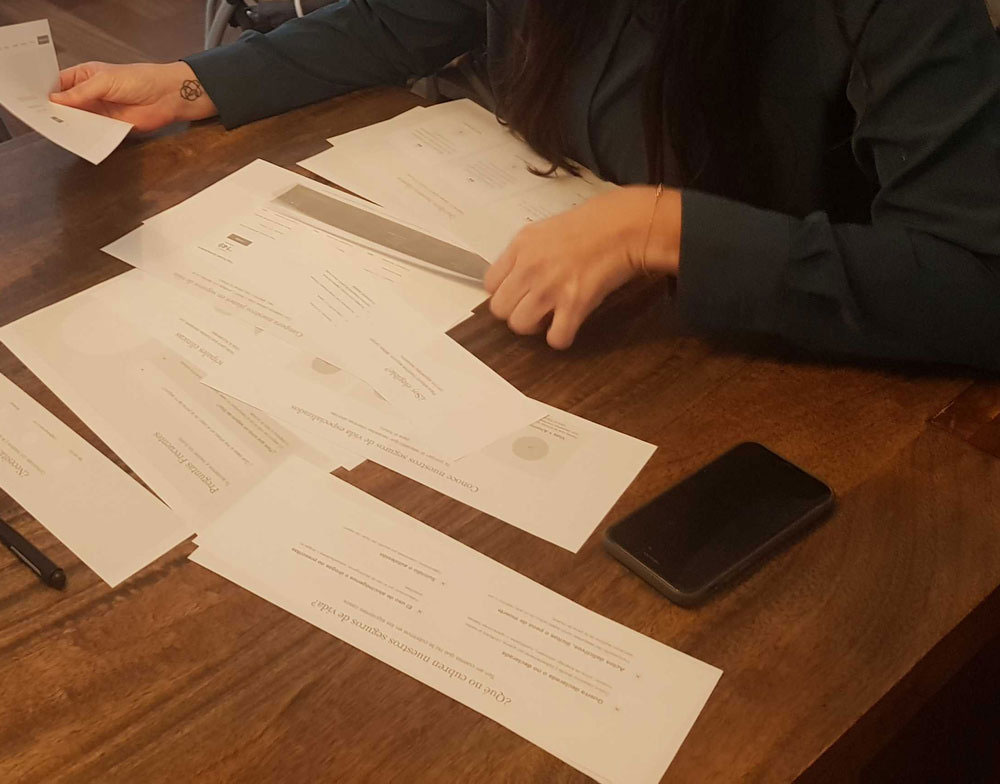
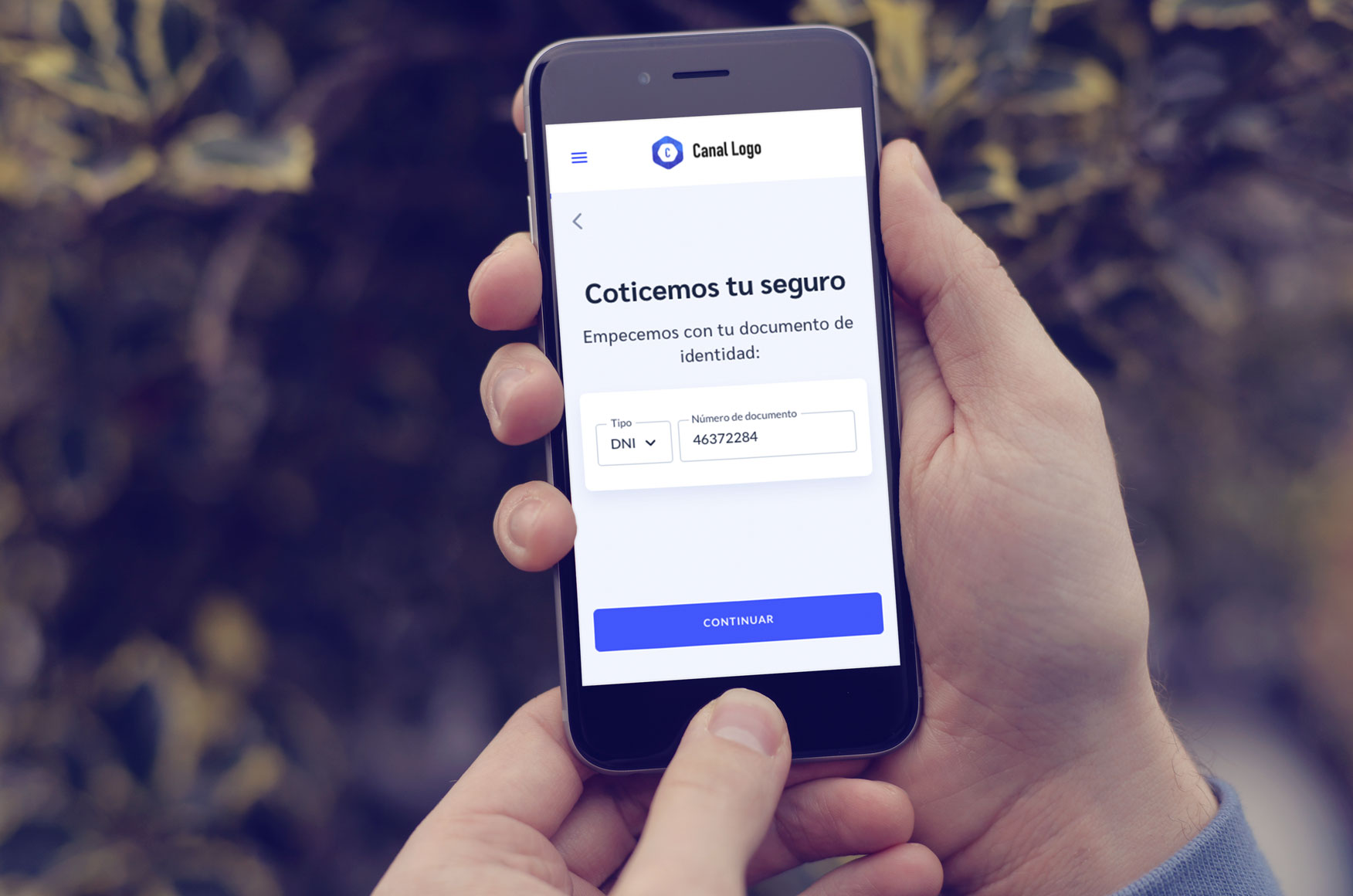
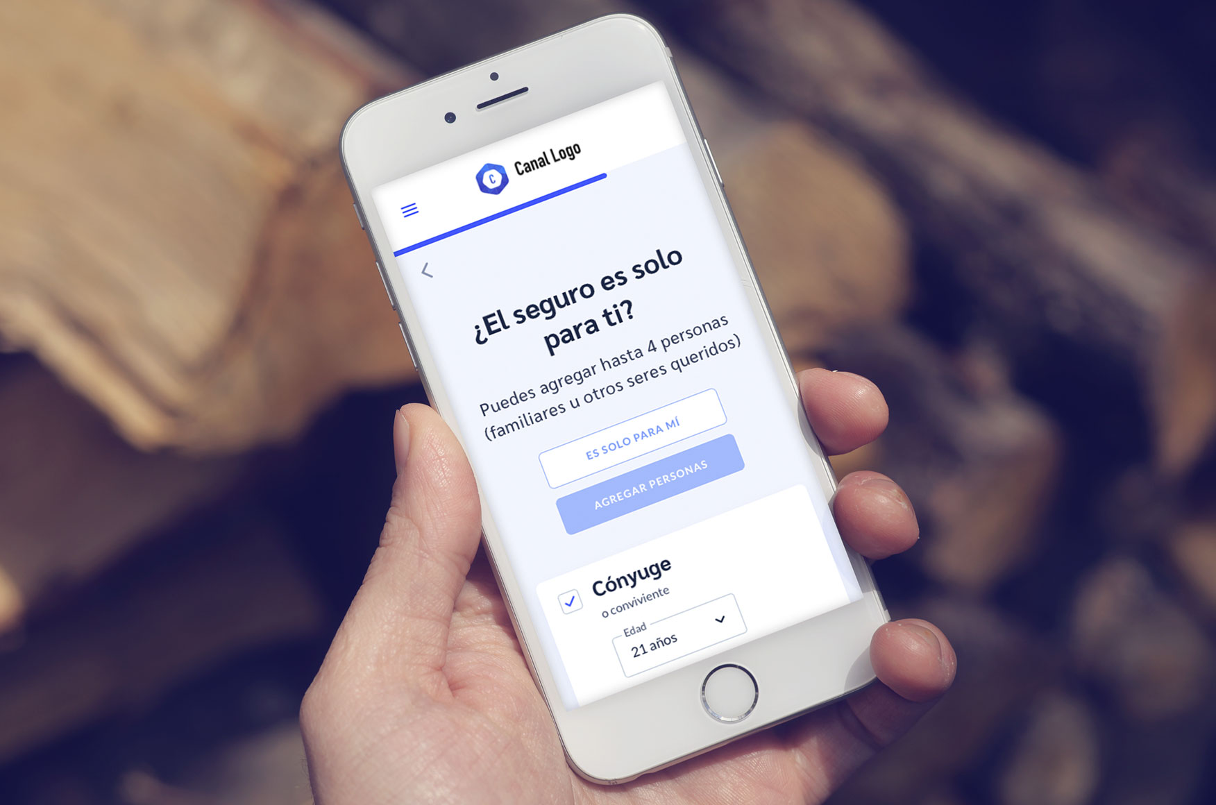
The most exasperating thing about buying health and life insurance was the awful load of questions you are asked to check if you are eligible. So we drafted a few alternatives to reduce these questions to its minimum, and took our prototypes to our users.
They pointed out what were the most relevant sections of the landing page for them, what made sense and what ideas we should discard.
In the process, we pointed out that we were going to keep working only on Health insurance, since it had all the pieces we needed to complete the project.
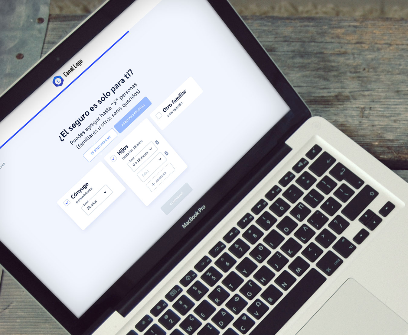
The refinement: health insurance
After some testing and iterations to our low fidelities for Health insurance, we developed a neutral visual to apply to the interfaces. Since the site was meant to be customizable, its final look and feel would always be the clients’ own brand. So we kept it simple and clear.
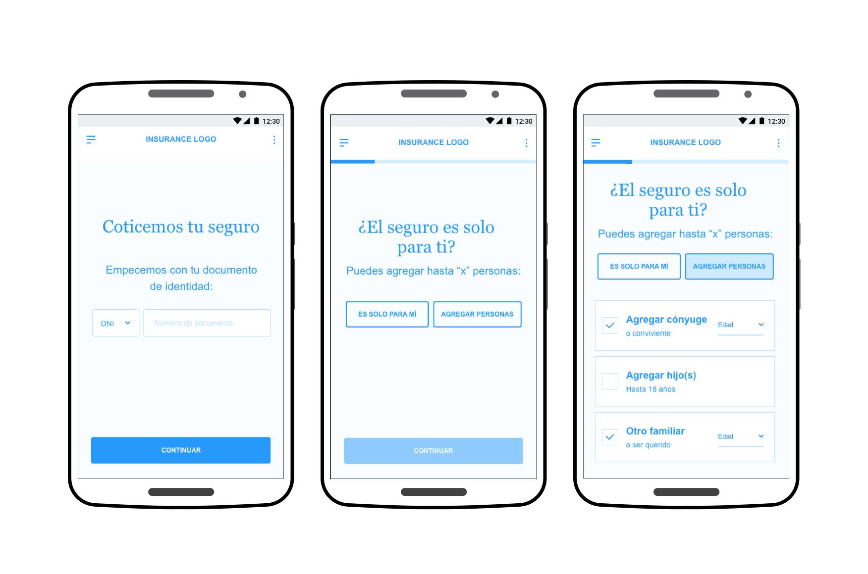
Check out a prototype:
Reflections
Being part of this project allowed me to lead a small team through the whole process of research to the final visual design. We were running against the clock but we managed to design a very concise buying process, with clean interfaces and simple language anyone can understand. Our clients were pleased with the final result.